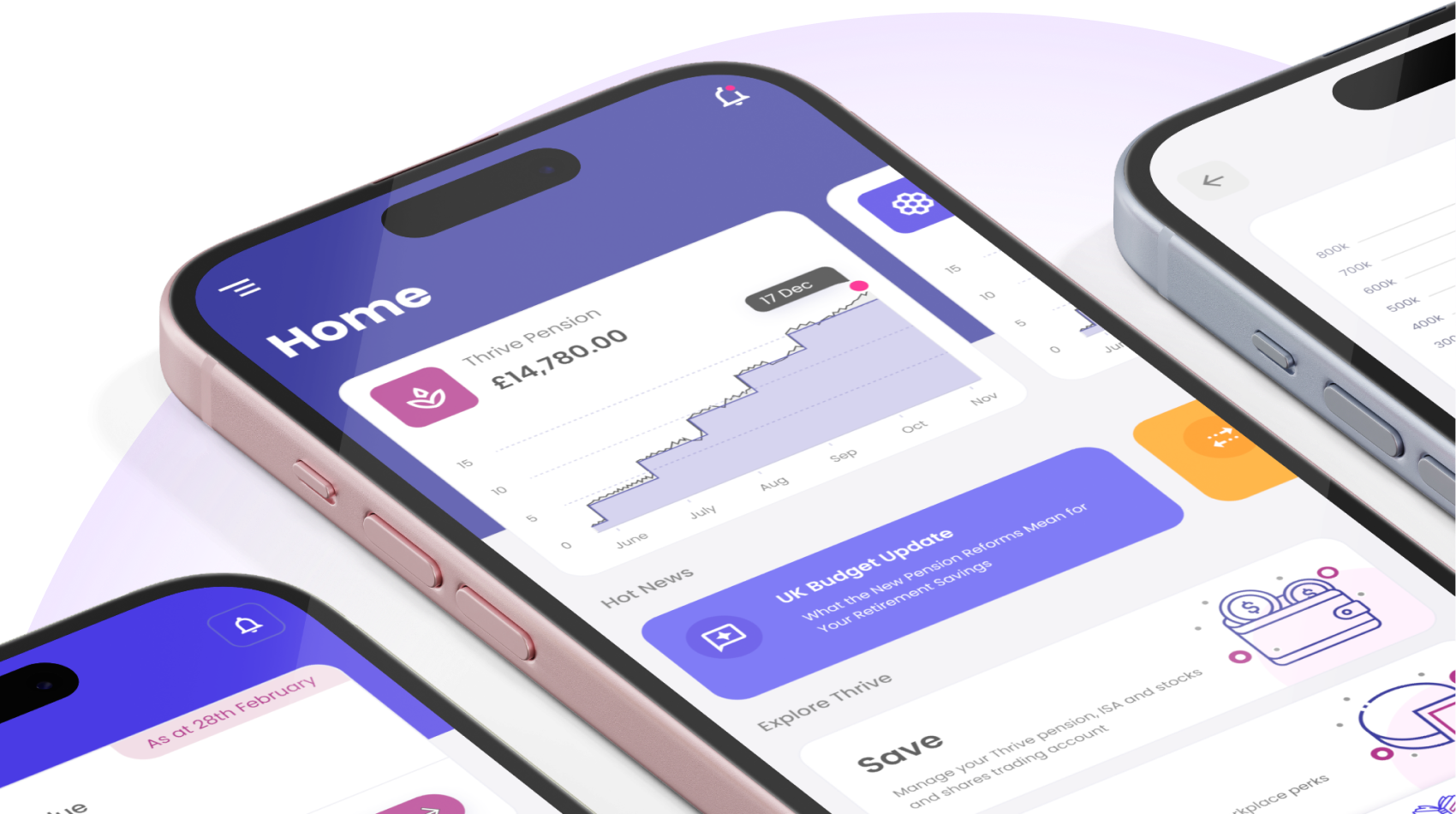
A holistic platform for financial wellbeing, benefits and pensions.

Thrive is a holistic platform that brings employee benefits, workplace pensions and financial wellbeing together in one connected experience. Built to increase engagement, reduce administration and strengthen workforce performance.
  • My role: Lead Interaction Designer
  • ‍Company: Blackfinch Group
  • ‍Scope: Employee App · Employee Website
Benefits
Financial Wellbeing
Pensions
Product Team
12
Platforms
Mobile, Web App
Website
www.mythrive.co.uk

THE CHALLENGE

Existing Problems of UK Employees & Employers

Employees struggle to understand pensions, benefits, and wellbeing, while employers deal with the same fragmentation - juggling multiple providers, inconsistent data, and unclear impact.
UK Employers
UK Employees

Employees

Poor pension engagement

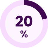
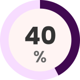
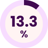
20% of employees took no action on their pension in the past year
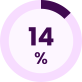
14% never review their pension at all

Under‑used benefits

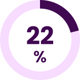
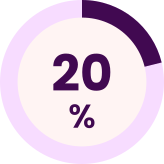
22% of employers have no objectives for their benefits package, meaning benefits are offered without clarity, purpose, or communication strategy.

Financial stress and anxiety

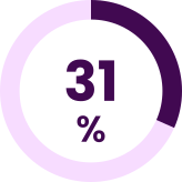
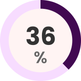
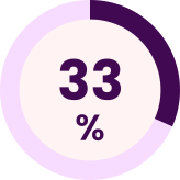
31% of employees say financial worries negatively affect their performance at work.

Employeers

15 hours

Struggle to administer multiple platforms

UK office workers lose 15 hours per week to manual admin tasks

£14,000

Using multiple platforms is costly

UK businesses lose £14,000 per employee per year to manual admin caused by fragmented systems

MY ROLE

Lead Interaction Designer
Focus on Employee App & Website
Overseeing the end‑to‑end design of the Employee App and Employee Website. My responsibility was to ensure the product experience was coherent, intuitive, and aligned with both user needs and business goals.
  • Owned end‑to‑end design for the Employee App and Employee Website
  • Ensuring alignment with user needs and business goals
  • Collaborated with stakeholders to gain alignment, resolve constraints, and communicate design value
Thrive
Employee App
Website

DESIGN JOURNEY

The insights

My research uncovered the key barriers preventing people from feeling confident about their financial future. These insights helped us identify the biggest opportunities and shape the experience strategy for Thrive.
1.1
RESEARCH

Data Analysis & Persona Development

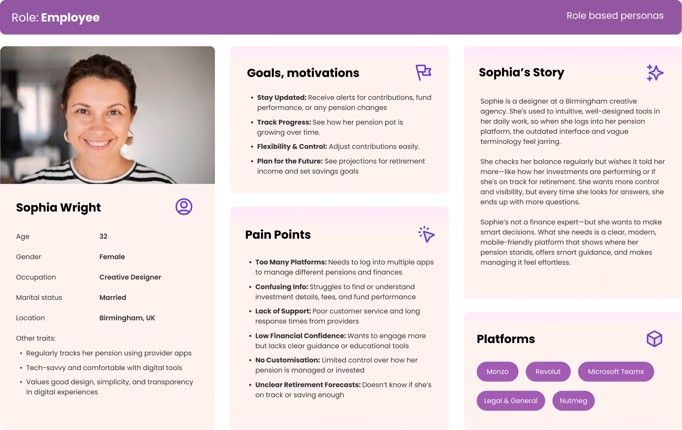
We conducted user interviews to validate our assumptions and uncover deeper insights into user needs and challenges. Using Sophie Wright, a creative designer, as a representative persona, we synthesized insights from interviews and behavioral data among employees engaging with pensions & benefits.
Methodologies:
User Interview
Personas

Findings derived from persona

Multiple apps create friction  
Sophia regularly logs into Monzo, Revolut, and several pension provider apps, which makes her financial routine feel fragmented and inefficient.
Support feels distant and generic  
Poor customer service and lack of personalised coaching leave Sophia feeling unsupported.
Complex language blocks engagement  
Despite being tech-savvy, Sophia finds pension terminology and vague projections confusing, which discourages her from exploring further options.
Benefits fade into the background
Her attention is drawn to pensions, while other benefits remain overlooked because they aren’t clearly surfaced or connected to her financial wellbeing journey.
Knowledge gap limits confidence
Sophia struggles to interpret financial terms. This lack of accessible financial knowledge leaves her uncertain about whether she’s making the right decisions and discouraging deeper engagement.
1.2
RESEARCH

Analysing The Market Landscape

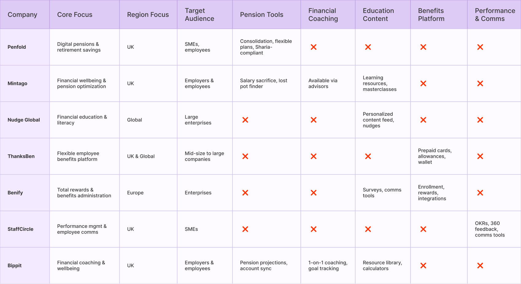
By applying the competitive landscape analysis, it provides a comprehensive understanding of market and key competitors. The findings informed the development of a well-structured information architecture for Thrive, ensuring alignment with industry standards and user needs.
Methodologies:
Competitive Landscape Analysis
Market Reseach
2
DEFINE

What We Learned

I synthesised and analysed insights from user interviews to uncover the underlying needs, behaviours, and pain points shaping the financial experience. These insights became the foundation for defining opportunities and guiding the next stages of Thrive’s design.
Methodologies:
Data Analysis
Synthesis

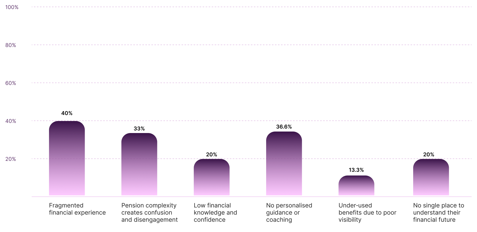
Key Findings

Fragmented financial experience
Employees are forced to navigate multiple disconnected systems for pensions, benefits, and financial wellbeing.
Low financial knowledge & confidence
Most employees struggle with everyday financial decisions - budgeting, debt, savings, and long‑term planning.
No personalised guidance or coaching
Employees are left to self‑navigate complex financial decisions.
Pension complexity creates confusion and disengagement
Complex terminology, processes, and limited visibility make pensions difficult to understand, leaving employees uncertain about their options and less motivated to take action.
Under‑used benefits due to poor visibility
Employees frequently don’t know:
- What benefits they’re eligible for
-How to access them
- How benefits connect to their financial wellbeing
No single place to understand their financial future
Employees want clarity, simplicity, and a sense of control. But today, they have:
- Scattered information
- No unified view of their financial wellbeing
- No clear path to improve their situation

THE OPPORTUNITY

How might we

Reframed stakeholder insights into How Might We statements that guided ideation across all four UX solutions.
reduce financial fragmentation
so employees can see pensions, benefits, and savings in one connected experience.
make complex financial processes simple
so employees feel confident engaging with pensions and retirement planning.
encourage action, not just awareness
so employees move from understanding their finances to making meaningful changes.
empower financial wellbeing as part of work culture
so employers see Thrive not just as a tool, but as a partner in employee wellbeing.

IDEATE & PROTOTYPE

From research to product direction

I translated research findings into opportunities for the wider Thrive service, then zoomed in on one of the most critical journeys: pension consolidation.

3. Shaping the Thrive Services

3.1
IDEATE

Facilitate Ideation Workshops

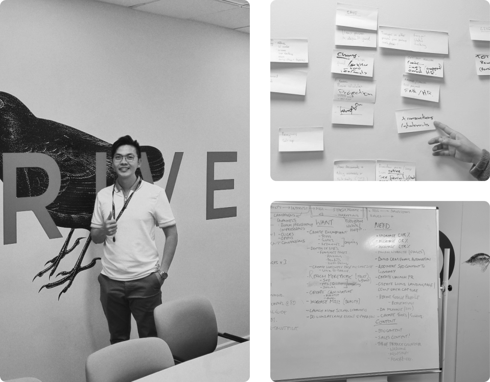
At the early stage of Thrive, I facilitated weekly ideation workshops, bringing together key team members from different departments, including PMs, BAs, developers.... By combining diverse expertise, these sessions created a dynamic environment for generating innovative solutions. The core methodology was group brainstorming, where participants freely shared ideas and explored various solutions to solve the user problems.
Methodologies:
Group Brainstorming
Weekly Workshop

Idea Clusters derived from the workshops

01

Understand my money

  • Personal financial overview
  • Pension health score
  • "Where am I today?" dashboard
  • Financial goals
  • Net worth overview
02

Manage my pension

  • Pension consolidation
  • Pension contribution calculator
  • Increase/decrease contributions
  • Compare pension providers
  • Track pension performance
03

Plan for my future

  • Retirement planner
  • "How much will I need?" calculator
  • Scenario planning
  • Set financial goals
  • Future income projection
04

Learn & build confidence

  • Financial education hub
  • Bite-sized financial lessons
  • "Explain this to me" feature
  • Personalised learning paths
  • Financial terminology glossary
05

Get financial support

  • Financial coaching
  • Book a coaching session
  • Ask an expert
  • Personalised financial recommendations
  • Chat-based financial guidance
06

Discover employee benefits

  • Benefits marketplace
  • Personalised benefits
  • Benefits eligibility checker
  • Benefits comparison
  • "Benefits you might be missing"
3.2
IDEATE

Prioritise Features

After evaluating feasibility, desirability, and viability, we voted on the features most relevant to Thrive’s MVP. These features directly support the four solution directions and balance employee needs with organisational impact.
Methodologies:
Brainstorming
Dot Voting
01

Understand My Money

  • “Where am I today?” dashboard
  • Personal financial overview
  • Net worth overview
Reasoning
These features are foundational, feasible to build, and highly desirable. They provide employees with a clear snapshot of their financial position, reducing fragmentation and cognitive load.
02

Manage My Pension

  • Pension health score
  • Pension contribution calculator
  • Financial goals
Reasoning
These directly address pension complexity. They are viable to implement early and help employees engage with pensions through clarity and actionable steps.
03

Learn & Build Confidence

  • Bite‑sized financial lessons
  • “Explain this to me” contextual guidance
  • Financial terminology glossary
Reasoning
Lightweight, feasible features that embed education directly into tasks. They increase confidence and reduce hesitation without heavy infrastructure.
04

Get Financial Support

  • Personalised financial recommendations
  • Chat‑based financial guidance (basic version)
Reasoning
These provide scalable, personalised support. Coaching sessions and expert booking were deferred for later due to higher resource requirements.
4.2
IDEATE

Define Thrive’s Value Proposition

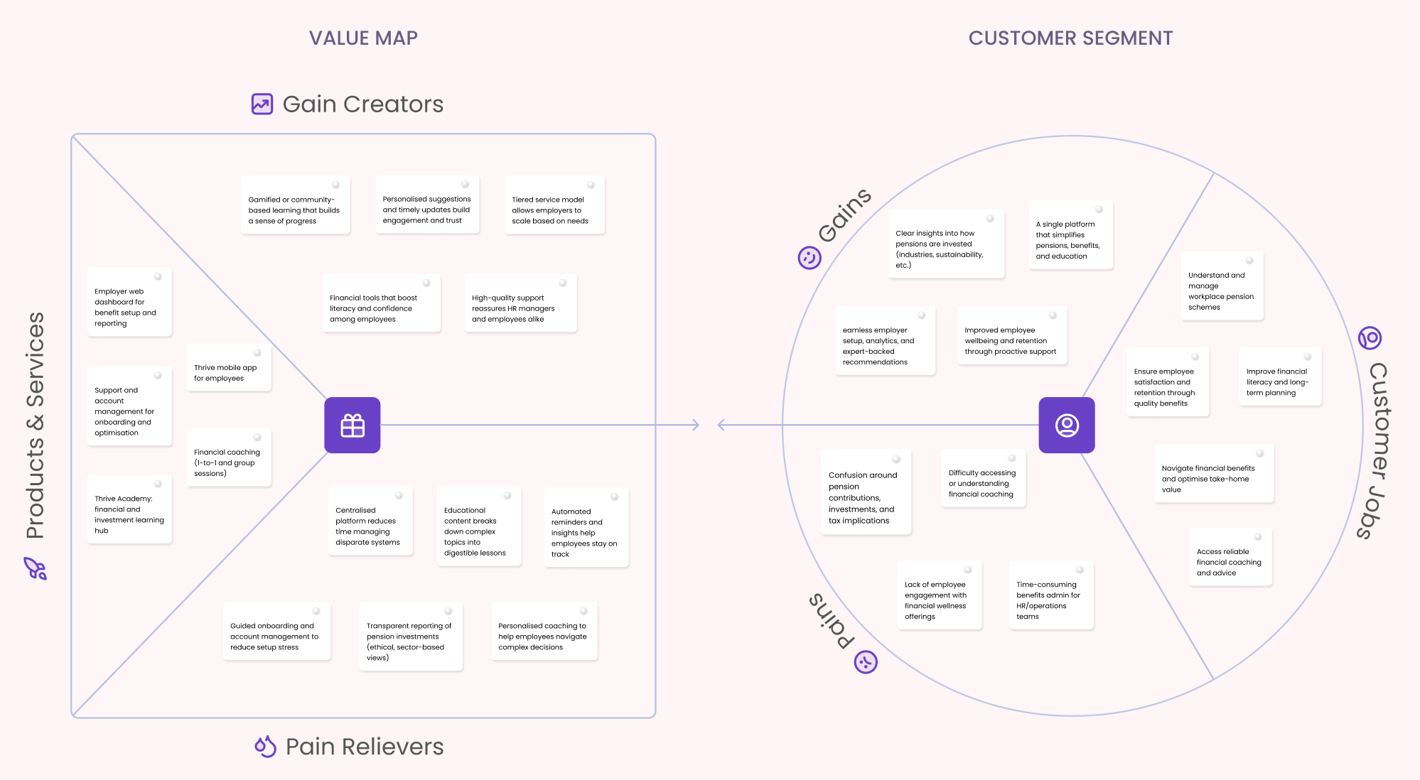
We also develop the Value Proposition Canvas for the Thrive project. It helps me to gain a understanding of user problems and what should our product should focus on. We identified 03 key elements that define Thrive’s core offerings:  
Value Proposition Canvas
01
Bringing financial wellbeing together
Provides employees with a single, connected dashboard that consolidates pensions, benefits, and financial wellbeing.
  • Pain Relieved: Fragmentation across multiple systems and lack of visibility into overall financial health.
  • Gain Created: Employees feel in control, with a holistic platform.
02
Confidence through simplicity
Simplifies complex pension and financial concepts with progressive disclosure and finance lessons.
  • Pain Relieved: Confusion and hesitation caused by jargon and complexity.
  • Gain Created: Employees gain confidence to take action, supported by clear guidance and embedded education.
03
Personalised support at scale
Offers personalised recommendations and chat‑based guidance, ensuring employees receive support tailored to their goals and circumstances.
  • Pain Relieved: Generic guidances and supports.
  • Gain Created: Employees feel supported with access to both digital guidance and human coaching.
4.3
IDEATE

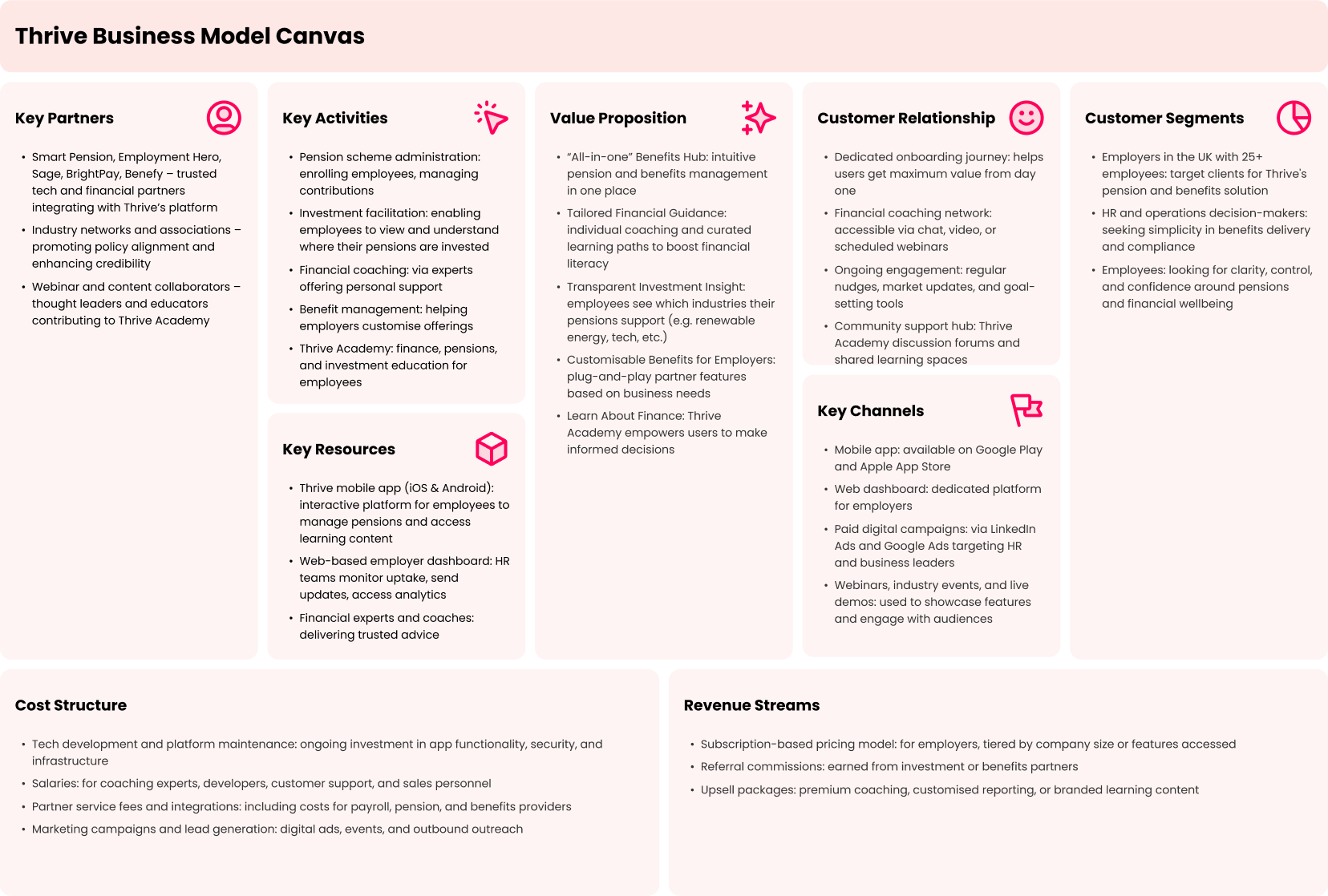
Design The Business Model

Business Model Canvas
I worked with Stakeholders to develop the Business Model Canvas to translate user insights into a clear framework, aligning Thrive’s design solutions with value propositions, customer needs, and business goals.

What we achieved

Key Activities

We agreed that Pension management, benefits, and financial wellbeing (education & coaching) as core activities of Thrive.

Key Partners

We identified trusted pension, payroll, and benefits providers as essential integration partners, alongside industry networks and thought leaders to strengthen credibility.

Value Proposition

Stakeholders aligned on four pillars: an all‑in‑one benefits hub, tailored financial guidance, transparent investment insights.

Customer Relationships

We mapped out digital service delivery, coaching networks, and community hubs to build trust and engagement.

Customer Segments

Employers with 25+ staff, HR decision‑makers, and employees seeking clarity and confidence were prioritised as target audiences.

Channels

Mobile apps, employer dashboards, paid campaigns, and webinars were chosen as effective distribution and engagement channels.

Key Resources

We defined the mobile app, employer dashboard, and expert coaching network as critical resources to deliver value.
4.4
IDEATE

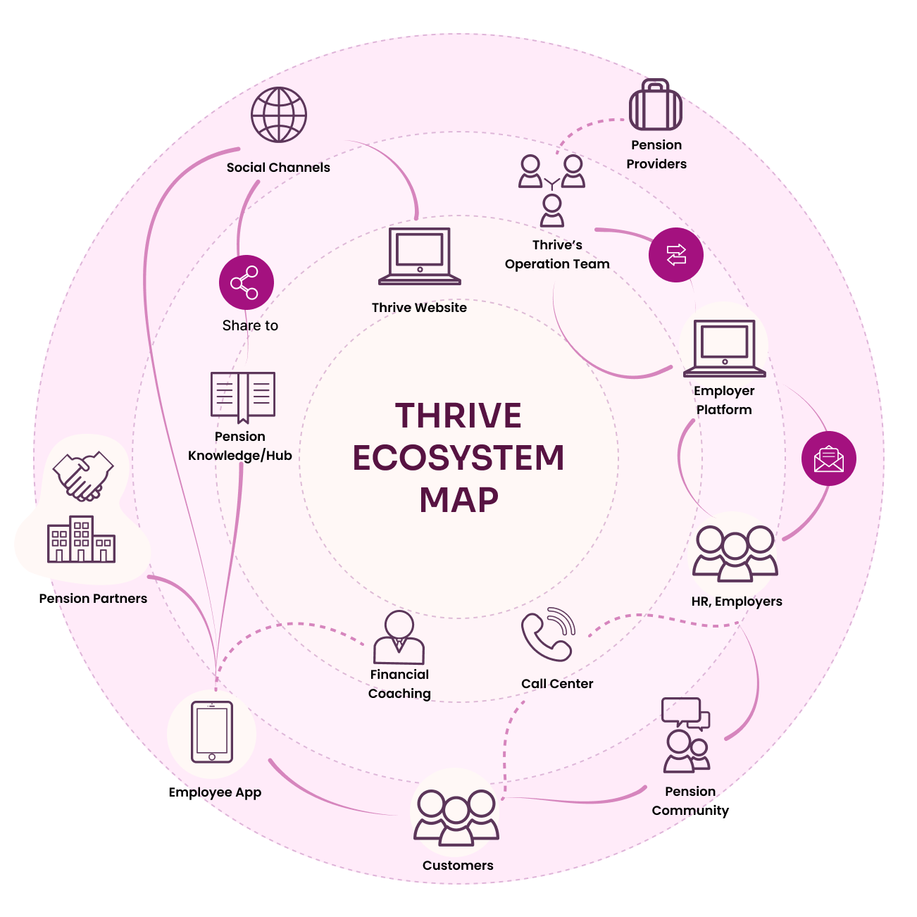
Propose Thrive's Ecosystem Map

When I designed Thrive’s ecosystem map, my focus was on creating a cohesive and interconnected experience across every touchpoint. I mapped out how each element, from the Employee App and Employer Platform to the Thrive Website, Pension Community, Pension Knowledge Hub, and Financial Coaching. The goal was to build a system where information flows seamlessly, engagement feels natural, and every interaction reinforces empowerment and trust.
Thrive Employee App
A personal financial wellbeing companion offering coaching, education, pension tools, and goal‑tracking in one place.
Thrive Employer App
A management hub for employers to monitor wellbeing engagement, configure benefits, view insights, and support their workforce.
Thrive Website
A public gateway showcasing Thrive’s mission, products, resources, and onboarding paths for employers and employees.
Thrive Admin Portal
A secure backend for managing users, permissions, content and integrations across the entire Thrive platform.
4.5
IDEATE

Key UX Solutions for MVP

Through a series of ideation workshops and by applying different strategic and design methodologies, we explored multiple opportunities for Thrive. We then synthesised the ideas into four key UX solutions that formed the foundation of the MVP.

UX SOLUTION 01

Connect the Financial Experience

Bringing pensions, benefits, savings, and financial wellbeing into one connected experience. A centralised dashboard gives employees a clear overview of their financial position, while allowing them to access and manage different areas without switching between disconnected systems.
Why choose: Research showed that fragmentation made it difficult for employees to understand their overall financial position and created unnecessary friction between different financial services. Connecting these experiences creates a single source of truth and reduces the cognitive load of managing finances across multiple platforms.

UX SOLUTION 02

Simplify Pensions

Redesigned the pension experience around clarity and guidance, breaking complex information and processes into simple, manageable steps. Key information is presented progressively, with contextual explanations, clear actions, and visual feedback to help employees understand what is happening and what they need to do next.
Why choose: Pensions are complex and often filled with unfamiliar terminology, making employees hesitant to engage with them. Rather than removing the underlying complexity, I focused on making that complexity easier to understand, helping users feel more confident when making important decisions about their retirement.

UX SOLUTION 03

Build Financial Confidence

I integrated accessible financial education, practical tools, and contextual guidance throughout the experience. Instead of separating learning from financial tasks, employees can discover relevant knowledge and guidance at the moment they need it.
Why choose: Low financial knowledge can prevent employees from taking action, even when useful financial products and benefits are available to them. Embedding education within the experience helps turn complex financial concepts into practical, actionable knowledge and encourages more confident decision-making.

UX SOLUTION 04

Personalise Financial Support

We introduced personalised financial guidance and coaching to help employees navigate decisions based on their individual goals, circumstances, and financial needs. Employees can receive relevant recommendations and access human support when they need deeper guidance.
Why choose: Financial wellbeing is highly personal, and a one-size-fits-all experience cannot address everyone's needs. Combining digital guidance with access to coaching allows Thrive to support employees at different levels of financial confidence while helping them move from information → guidance → action.
4.5
IDEATE

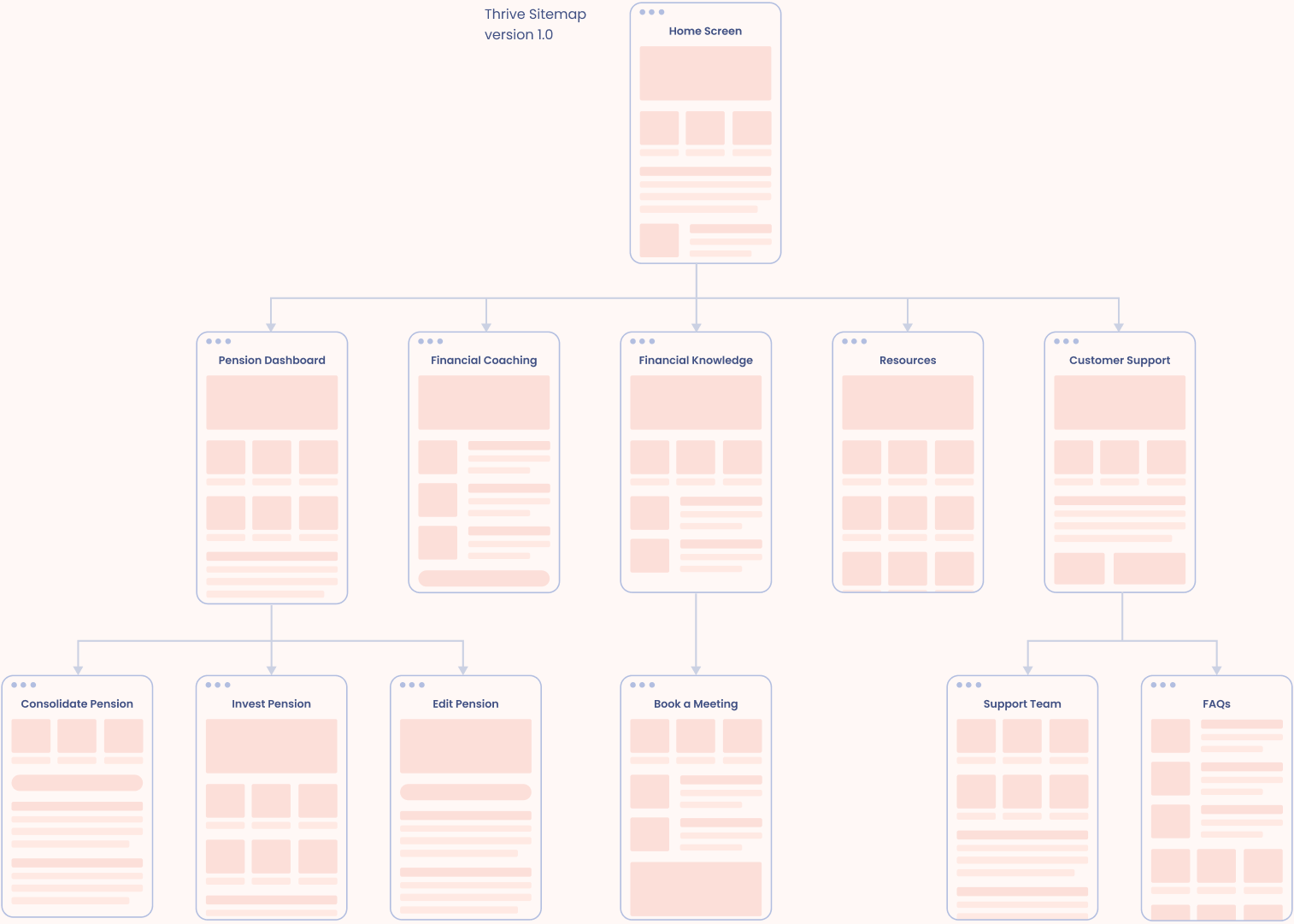
Map The Information Architecture

For Thrive, I worked with our business analysts and project managers to build a solid sitemap using a card-sorting method. We spent 02 hours in a workshop, sorting through ideas and structuring the platform to make sure it’s intuitive for everyone.
Sitemap
Ideation Workshops

5. One Key Journey: Pension Consolidation

5.1
IDEATE

Exploring user behaviour through journey maps

Showcase Pension Consolidation Journey Map

To get a real sense of how people deal with their pensions, I sat down with 04 users - some who were completely new to pension platforms and others who had used them before.

Hearing their experiences helped me understand just how confusing and emotionally loaded this topic can be. A lot of people weren’t just unsure about the process, they were unsure about themselves and whether they were “doing it right.”
To make sense of everything I heard, I turned those insights into 8 key user journeys that represent the most important moments in the pension experience.

Mapping these journeys helped me follow what users were doing, thinking, and feeling at each step. It also made it much easier to spot where things were breaking down and where the product needed to step in with clearer guidance or support.

The pension consolidation journey was the one that stood out the most. Many users didn’t know if consolidation was the right move, struggled to find the information they needed, and felt uneasy during long waiting periods with no updates.

By mapping this journey in detail, I could pinpoint exactly where the friction was happening and where we had opportunities to make the experience smoother and more reassuring.This process gave me a deep understanding of user behaviour, and it directly shaped the design decisions and solutions that followed.

Below is an sample of Pension Consolidation Journey.

Insights derived from the Journeys

01

Users hesitate because they don’t see the value

Most interviewees weren’t convinced consolidation was worth the effort. Without a clear understanding of the benefits, they felt unsure about taking action. This hesitation often stopped the journey before it even began.
02

Early‑stage confusion due to lack of guidance

In the first stage of the journey, many users felt frustrated because they didn’t know what information they needed or what steps were involved. The absence of clear explanations or guidance created unnecessary friction right at the start.
03

Complicated UI and information gaps during the input stage

By stage three, users were struggling with unclear UI elements and missing details. Many had to log into multiple pension providers just to double‑check information, which made the process feel disjointed and time‑consuming.
04

Anxiety caused by poor visibility during the waiting period

Stage five was one of the most emotionally challenging moments. Users felt lost due to the lack of notifications, updates, or visibility into the consolidation progress. This uncertainty made them worry that something might have gone wrong.
05

The overall process feels too long and demanding

Across the entire journey, users consistently described the process as lengthy, repetitive, and heavy on manual input. The number of steps and the amount of information required made the experience feel overwhelming.
06

Users want a clear record of what they’ve done

Several interviewees mentioned wanting a simple way to review their past actions, what they submitted, what was confirmed, and what’s still pending. This desire for transparency and reassurance highlights the need for a clear activity history.

1

Think

Research user needs, analyze business goals, and define the problem to ensure a clear direction.

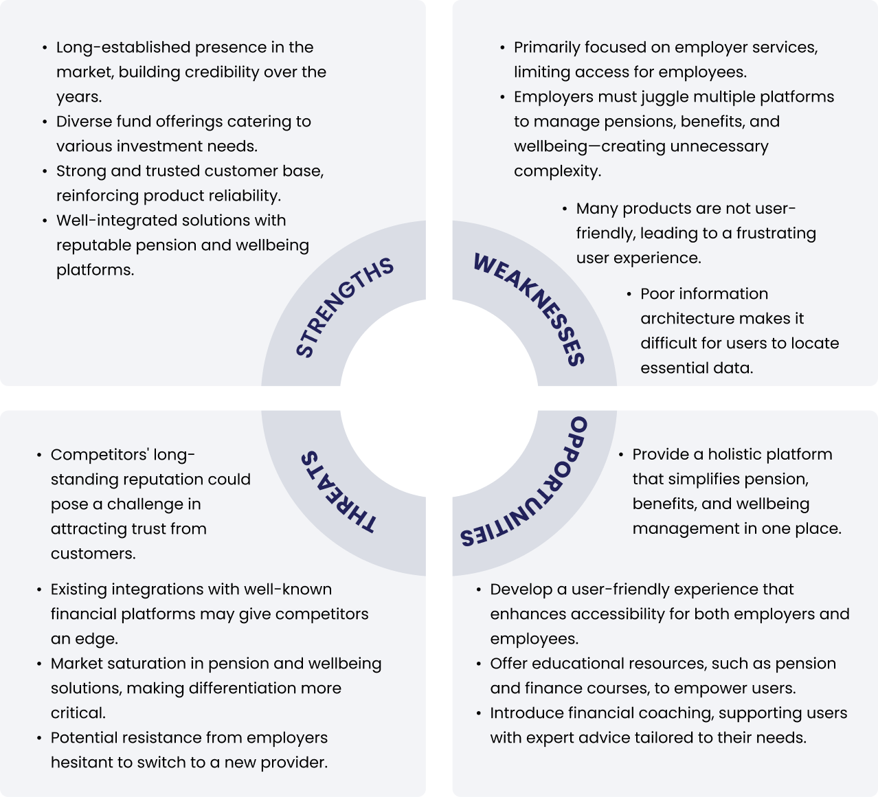
Identify Thrive's strengths & challenges

SWOT Analysis
To gain a clear strategic direction for Thrive, I conducted a SWOT analysis, a valuable method for understanding our product's strengths, weaknesses, opportunities, and threats in relation to the market and competitors.

To ensure a well-rounded perspective, I facilitated a collaborative workshop with BAs and PMs to explore Thrive’s positioning, key differentiators, and areas for improvement.

This method helps us identify actionable strategies to enhance transparency, usability, and competitiveness.

2

Make

This phase is all about ideation—exploring possibilities, testing concepts, and shaping solutions that address the root-cause problems.
5.2
IDEATE

Design Service Blueprint

Service Blueprint
Ideation Workshops
By designing Service Blueprint, I define the critical interactions between users and the service. I break down the experience into distinct touchpoints, ensuring alignment between frontstage user actions and backstage support processes.
By collaborating with stakeholders, I gather insights into pain points, dependencies, and areas for improvement. I then visualize these elements in a structured blueprint, identifying key opportunities to streamline operations and enhance the customer experience.
Highlighting Advantages of my service blueprint:
  • Streamlined Automation  Reduced reliance on manual processing with smart automation, improving speed and accuracy.
  • Step-by-Step User Guidance  Users are informed at each stage of their action flow, increasing confidence and transparency.
  • Minimized Wait Time  Optimized backend processes help eliminate unnecessary delays and keep users moving forward.
  • Enhanced User Satisfaction  A smoother, clearer, and more responsive experience that respects users’ time and needs.
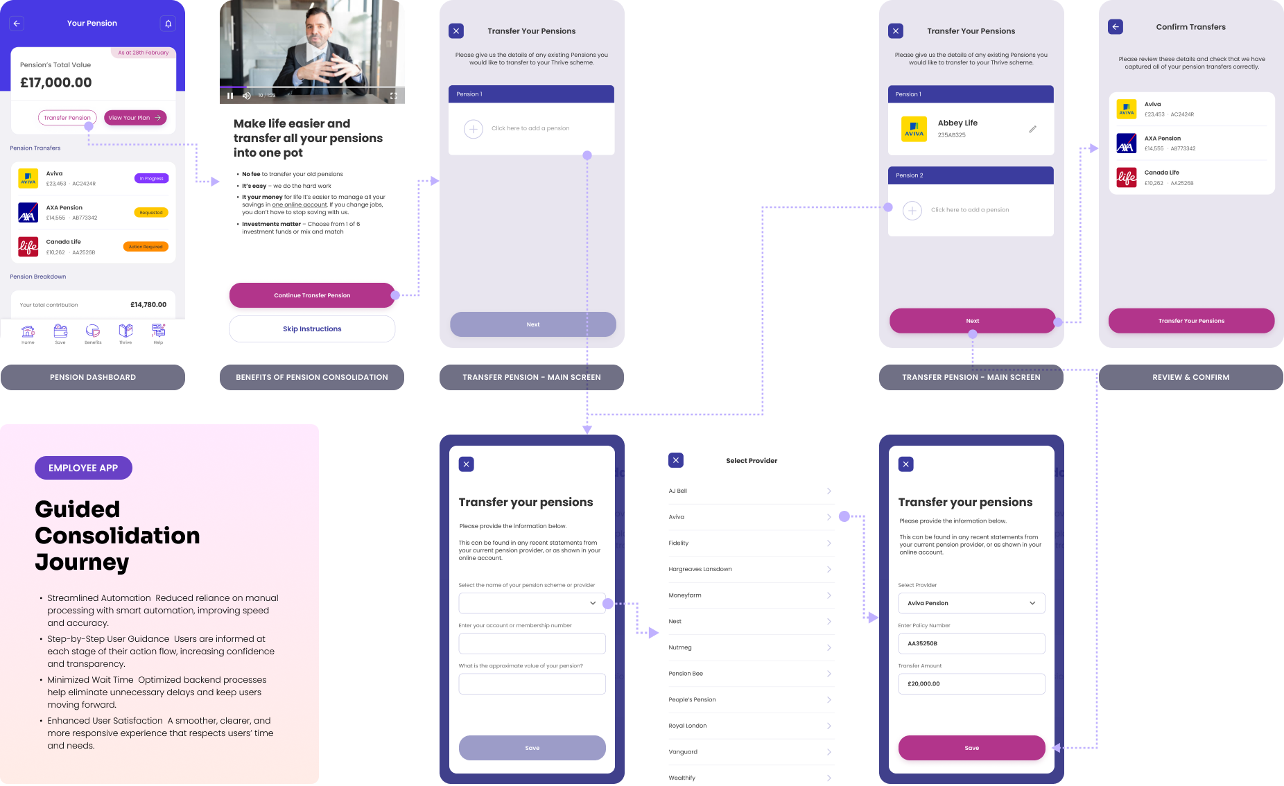
DESIGN EXPERIMENT 01

Guided Consolidation Journey

Test whether employees prefer a step‑by‑step, structured process when consolidating pensions.
Highlight the 3 key moments
01

Educate before asking users to act

Before users start the transfer, we explain why consolidation may be beneficial through concise information and video content.
02

Simplify the consolidation decision

Users can see their pension pots in one place, select the ones they want to transfer, and review their choices before confirming.
03

Make the invisible process visible

After initiating the transfer, users can return to their Pension Dashboard to see the current status of their consolidation.
Why choose this flow?
We chose this flow to balance guidance, simplicity, and user control. Rather than overwhelming employees with pension information upfront, we introduce relevant education at the moment they need it, simplify the consolidation decision into manageable steps, and provide ongoing visibility after submission.
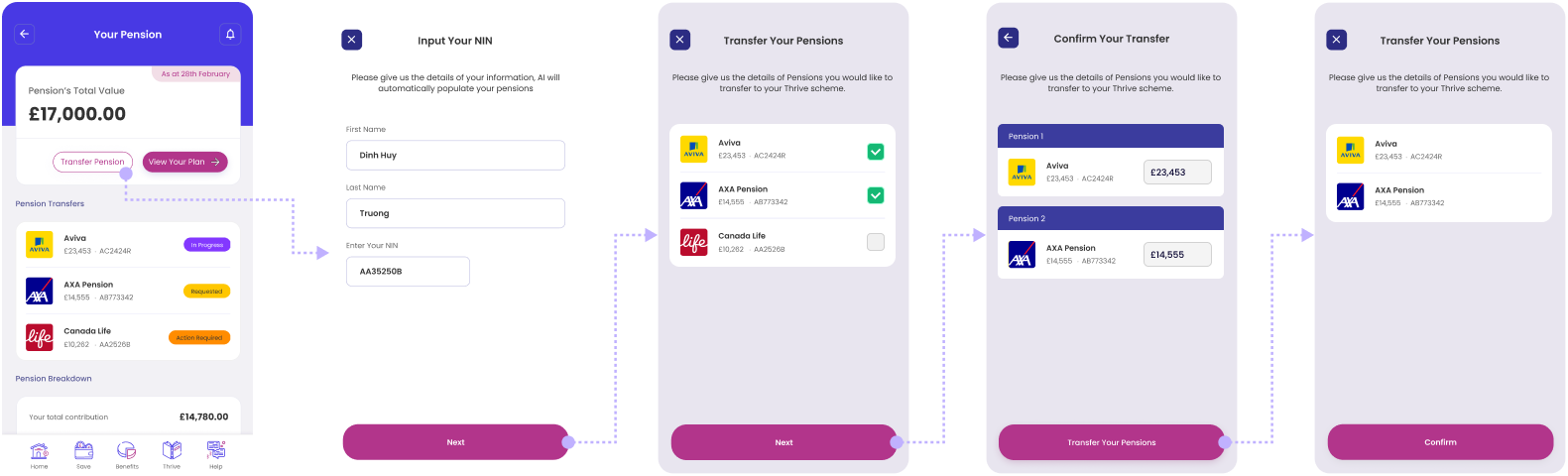
DESIGN EXPERIMENT 02

Quick Consolidation with Smart Recommendations

A fast, recommendation‑driven flow increases adoption among employees with low financial confidence.
Highlight the 3 key moments
01

Speed & Convenience

Employees can consolidate pensions in just a few steps, reducing friction and saving time compared to lengthy manual processes.
02

Confidence Through Automation

Smart recommendations simplify decision‑making by suggesting optimal consolidation options (e.g., lowest fees, best performance), helping employees feel secure even if they lack financial expertise.
03

Higher Adoption Potential

By lowering effort and embedding guidance directly into the flow, this approach encourages more employees to take action, increasing engagement with pensions and overall financial wellbeing.
Why rejected this flow?
At present, the system cannot automatically populate pension details from multiple external providers. This means employees must manually input or verify their pension information, which reduces the seamlessness of the experience and may lower trust in the recommendations.
5.4
IDEATE

Exploration 02

Service Blueprint
Ideation Workshops
By designing Service Blueprint, I define the critical interactions between users and the service. I break down the experience into distinct touchpoints, ensuring alignment between frontstage user actions and backstage support processes.
By collaborating with stakeholders, I gather insights into pain points, dependencies, and areas for improvement. I then visualize these elements in a structured blueprint, identifying key opportunities to streamline operations and enhance the customer experience.
Highlighting Advantages of my service blueprint:
  • Streamlined Automation  Reduced reliance on manual processing with smart automation, improving speed and accuracy.
  • Step-by-Step User Guidance  Users are informed at each stage of their action flow, increasing confidence and transparency.
  • Minimized Wait Time  Optimized backend processes help eliminate unnecessary delays and keep users moving forward.
  • Enhanced User Satisfaction  A smoother, clearer, and more responsive experience that respects users’ time and needs.
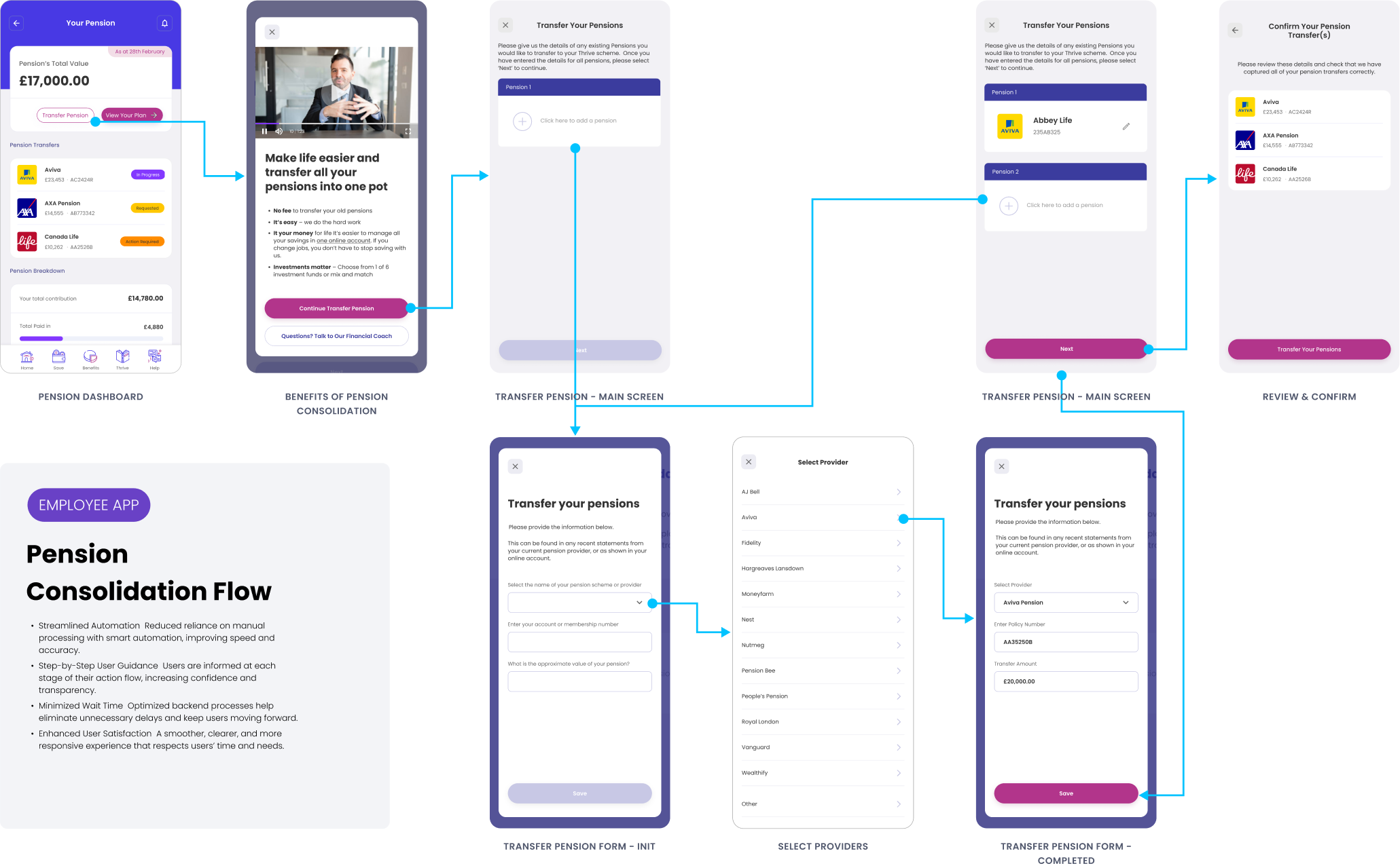
  • Open Pension DashboardUsers access their pension overview, including current balance and performance.
  • Tap "Transfer Pension"Initiates the pension consolidation process.
  • View Introductory Screen - A video and key information are displayed to help users understand the benefits of consolidating pensions.
  • Select Pension Pots - Users choose the pension accounts they wish to transfer from a list.
  • Review & Confirm - The selected pots are summarized; users confirm their choices before proceeding.
  • Transfer Status Displayed - Back on the Pension Dashboard, users can monitor the status of the transfer in real time.

VISUALS + FOUNDATION

Overview of Thrive Design

Showcases how research insights were translated into four UX solutions - connecting financial experiences, simplifying pensions, building confidence, and personalising support - to create a holistic and empowering journey for employees.

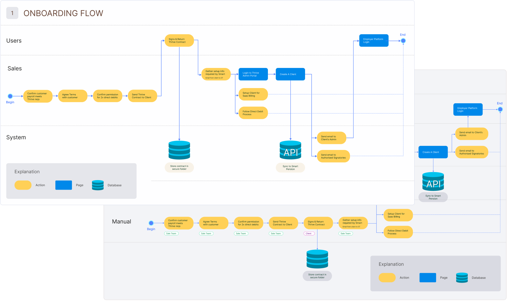
Design Key Userflows

Userflows
Ideation Workshops
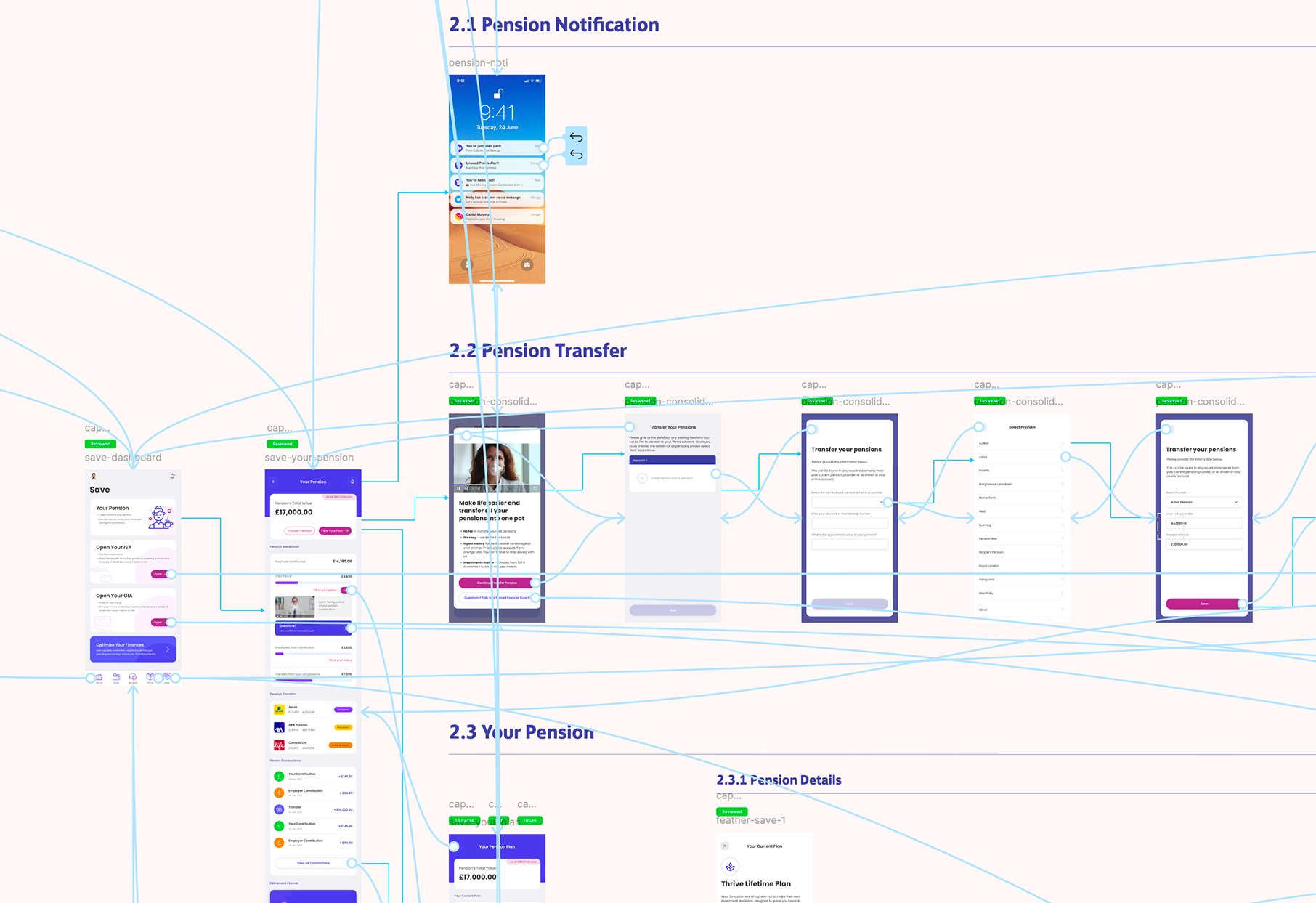
During an ideation workshop, I build user flows by first identifying key user goals and mapping out potential interactions. I start with brainstorming sessions, gathering insights from stakeholders to understand pain points and expectations.

Then, I create rough sketches or flow diagrams to visualize different pathways users might take. Through iterative discussions and feedback loops, I refine these flows to enhance clarity and efficiency.
Thrive Userflows ver1.0
6.1
THRIVE DESIGN

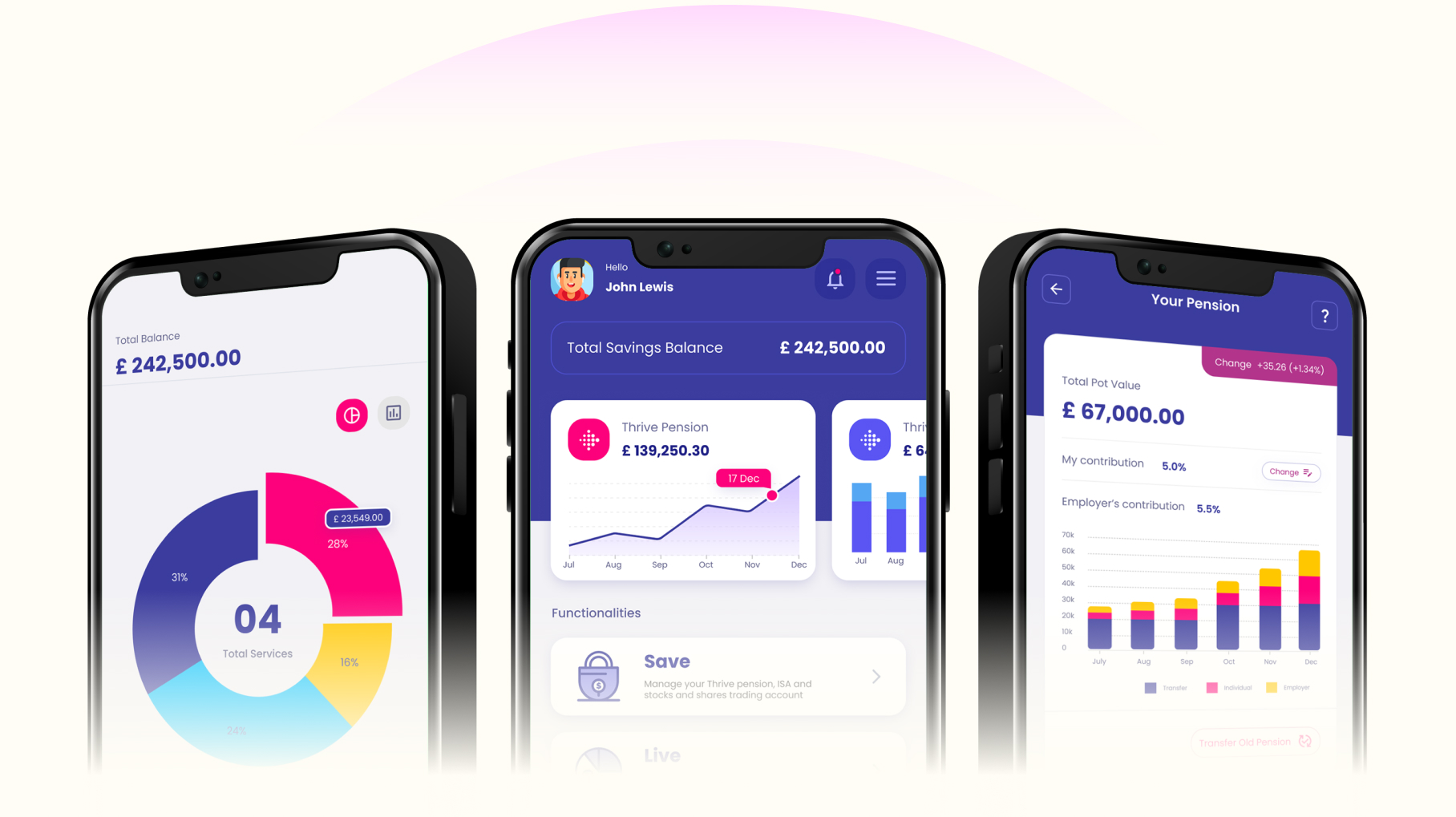
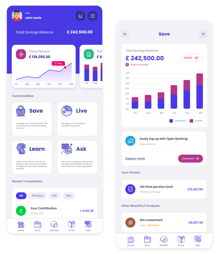
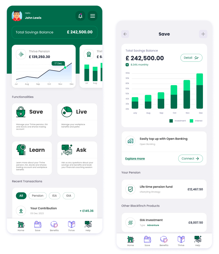
Thrive Employee Mobile App

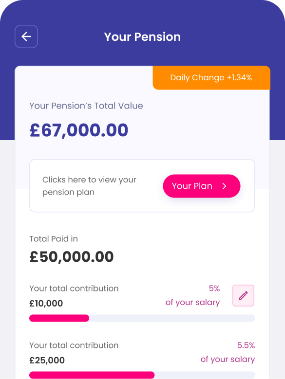
The Thrive employee mobile app brings pensions, benefits, and financial wellbeing into one connected, intuitive experience - simplifying complex processes, embedding confidence‑building education, and offering personalised support at scale.

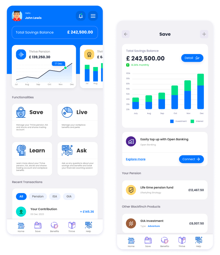
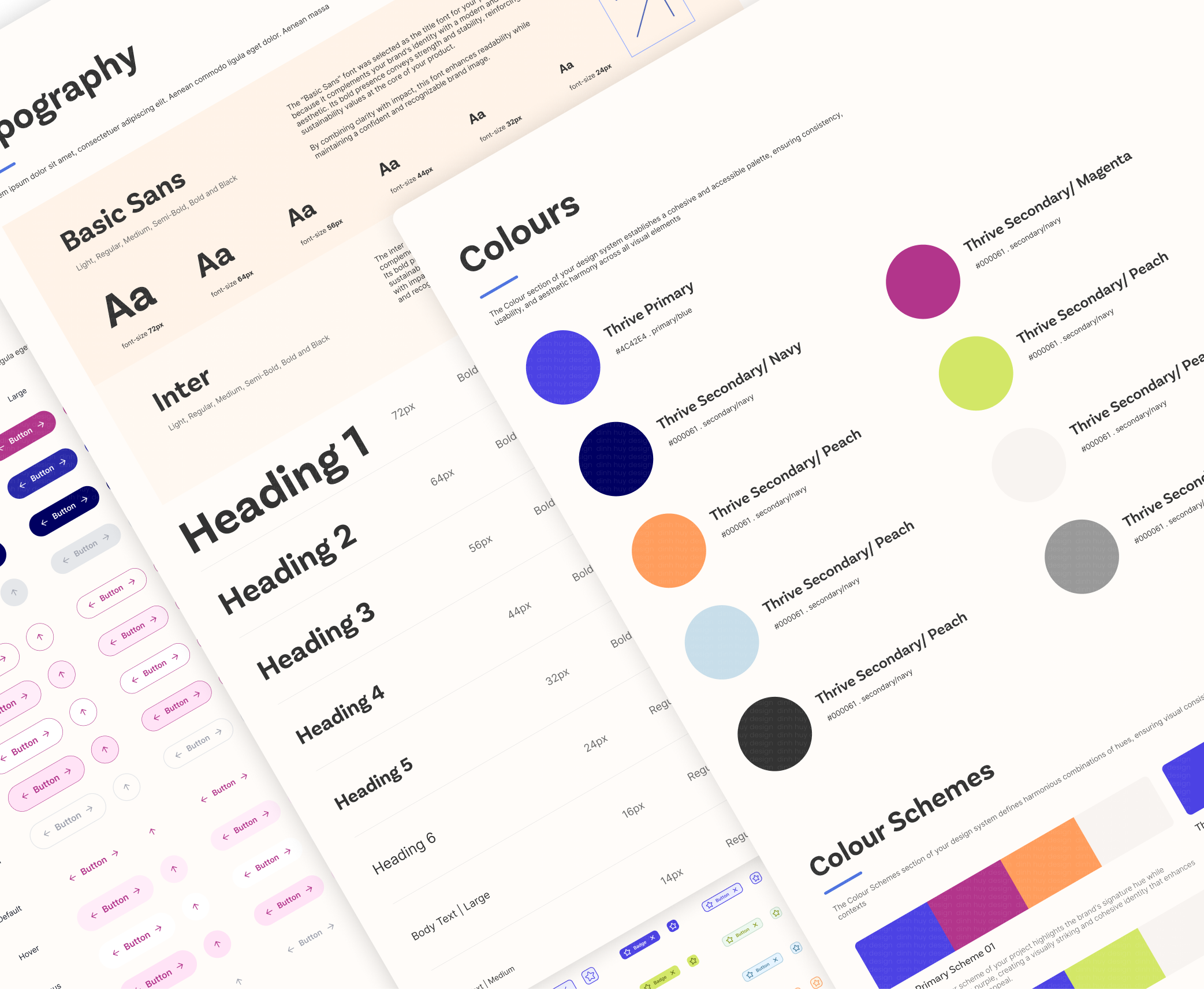
Thrive Design System

Establishes a unified set of components, patterns, and guidelines - ensuring consistency across the employee mobile app, simplifying complex financial flows, and enabling scalable.
6.1
THRIVE DESIGN

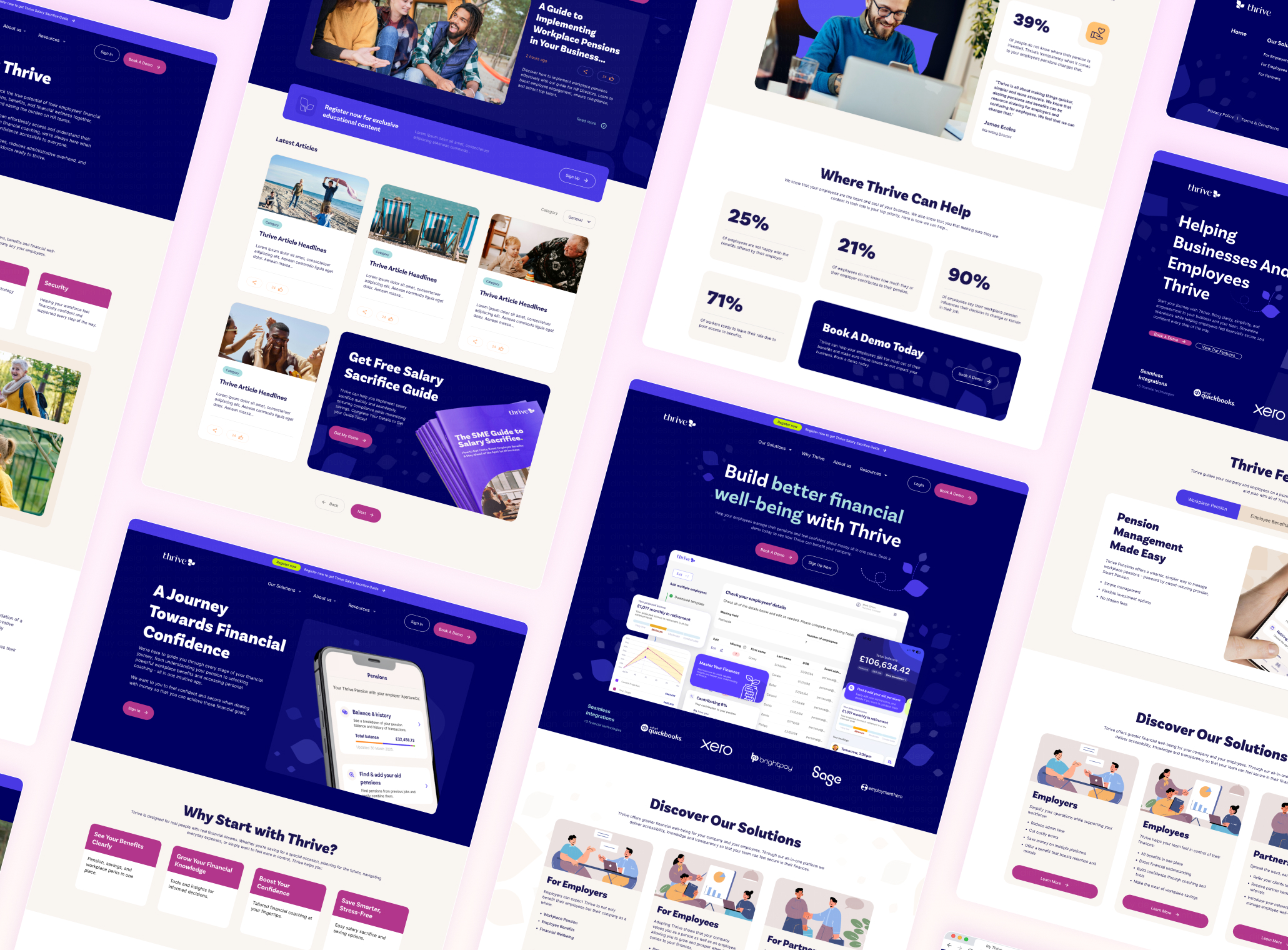
Thrive Website Interfaces

Guided by the brand-defined design system, I have developed a web UI for the Thrive project that embraces modern, formal, and minimalist aesthetics.
7.0
TEST

Validate Thrive's Prototype

To validate the effectiveness of the Thrive prototype, I conducted a series of usability tests and user interviews with participants representing our target audience. The goal was to understand how well the design supported real user tasks and whether the experience aligned with their expectations.
Key Outcomes
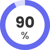
90% of users love Financial Coaching and Education Hub, highlighting these features as the most valuable and engaging parts of the experience.
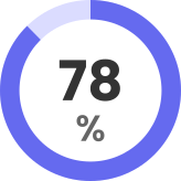
78% of users successfully completed all pension‑related tasks, demonstrating that the flows were clear, logical, and supportive even for users with limited pension knowledge.
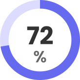
72% of users found the Thrive interface as friendly and easy to use, confirming that the visual design and navigation patterns felt intuitive and approachable.
8.0
REFLECTION

Reflection: Iteration, Learning, and Continuous Improvement

Building Thrive was an iterative journey.
Every round of testing uncovered new opportunities to simplify the interface, clarify content, and elevate the features users cared about most. Feedback directly influenced design decisions, helping the product grow into a clearer, more unified experience.This project highlighted how essential it is to stay open to change. Thrive’s development is ongoing, and user input continues to guide its direction, ensuring the platform remains relevant, accessible, and genuinely helpful.
Map Opportunities for Future Features
Outline potential expansions such as retirement planning tools, employer analytics, or deeper financial coaching. This shows strategic thinking and gives the project a forward‑looking arc.
Explore Long‑Term Behaviour Change Metrics
Identify what success looks like beyond app usage such as: confidence, understanding, consolidation completion, contribution increases. This helps position Thrive as a behaviour‑change product, not just a pension tool.
Personalisation at scale
Introduce smarter guidance and coaching features that adapt to different life stages, goals, and confidence levels.
Contact

Let’s Talk & Collaborate

I’m always excited to collaborate and exchange ideas! If you're passionate about design and eager to connect, feel free to reach out.

Let’s create, innovate, and inspire together!
(+44)-749-864-8205 or (+84)-363-720-448
Gloucester, United Kingdom
Thank you!
Your submission has been received!
Oops! Something went wrong while submitting the form.
overview
The Challenge
My role
research
Personas
Competitive Analysis
define
Analysis
ideate & prototype
Sitemap
Userflows
Mobile UIs
ideate & prototype
Design System
Desktop UIs